Featured collection
With the featured collection you can highlight a single asset. The collection uses a large 16:9 image.
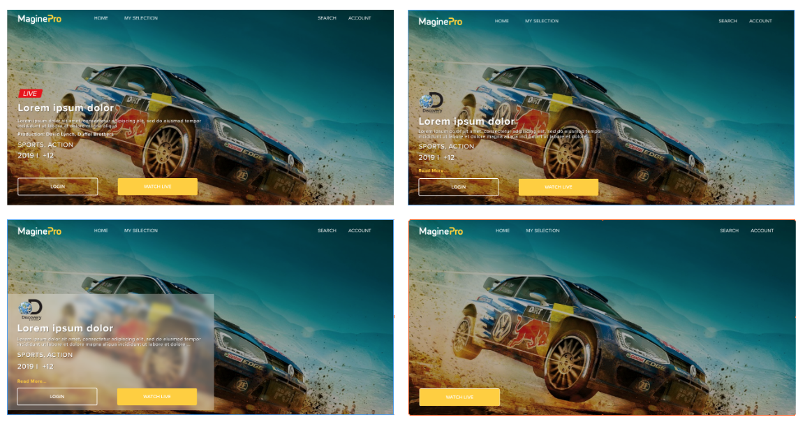
Collection design
With the collection UI tool, you have the possibility to influence the look and feel of every single featured hero collection you have in your service. You are in full control and can make sure that the information you display is always readable.
Main styling elements
Each collection can be customised independently and without consideration of its position on the page and is separated from the header behaviour.
Collection height can be set to large (90% of the screen) or small (60% of the screen)
Collection image can be covered with an overlay with customisable opacity & colour
Collection content information can be included in a container with customisable opacity & colour
Editorial elements
You can arrange your metadata in the following ways:
You can add and order up to 5 different objects in the content container
Different types of objects are available to allow full customisations to present your metadata like channel logo, single text, multi-text and list objects
All objects can be customised regarding font size and colour, number of lines and space
Depending on the screen size you can add more or less metadata
If you decide not to display any metadata then only the Call-to-Action buttons will be visible in the left corner of your collection image.
If you would like to know how to get started with your collection design read our guide here.
Geoblocking
If the first asset of a featured collection isn't available in a country and there is no backup asset the collection won't be visible at all in that country. Therefore it is important that you add at least one asset that is available in all countries if you have geo-restrictions in your service.